Insights Dashboard

UX Research + Design • 2019

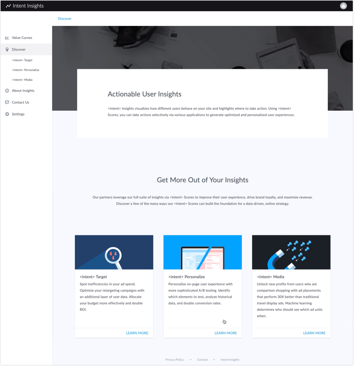
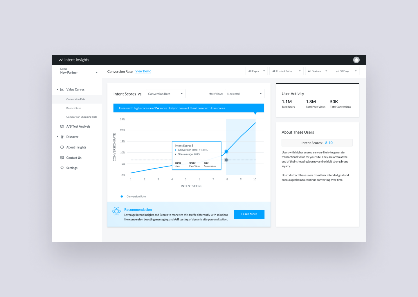
Intent's machine learning platform needed a visual front-end where partners can view data insights and product recommendations in a scalable way. As lead designer I owned research + design, worked closely with data scientists to visualize complex machine learning concepts, as well as helped implement the HTML/CSS front-end for our new analytics dashboard experience.

My Role

Lead UX Designer

Created for

Internal teams + external partners

Impact

50% faster workflow processes

10% more qualified leads generated monthly
Researching The Problem

We identified user needs by interviewing 6 stakeholders and key users within our sales, account management, product, optimization management, and strategic teams. Our users (both internal and external) shared pain points around current process for pitching data insights and integrating partners to our machine learning platform, most of which fell within the following 3 phases:

Pitches + onboarding All data-led pitches were shared via slide format, risking version control issues. Subsequent onboarding involved 5+ touchpoints, not a scalable process.
Generate + share data insights Partners wait 2+ weeks for a custom data insight report, which is a manual and cross-functional effort (e.g. optimization team spent 2 hours per partner generating these graphs).
New product discovery Our partners experienced a steep learning curve when it came to opting into new applications. Again, without a place for new products to be tested and discovered, custom 20-page slides were created to pitch new data products.

The Objective

From our research findings we synthesized that our users were constantly battling inefficiencies when it came to onboarding, generating data insights, and curating new product recommendations based on the partner’s own data. Combined with the business need for a visual front-end to our machine-learning platform, our goal for creating this product was to implement an intuitive as well as scalable process for educating and integrating partners onto our platform.

Designing The Solution

We went into our cross-functional ideation session armed with these insights and hypothesized: if we create an analytics dashboard with a self-service onboarding form, then we'd address today's scalability issues around integrating partners and generating insights because both internal and external users may access the tool for their business intelligence needs.

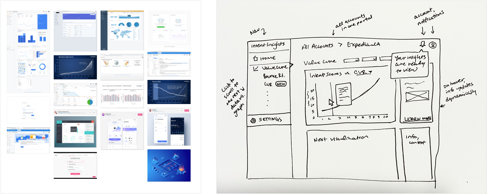
Ideation lightning demos and initial sketch of the dashboard experience.
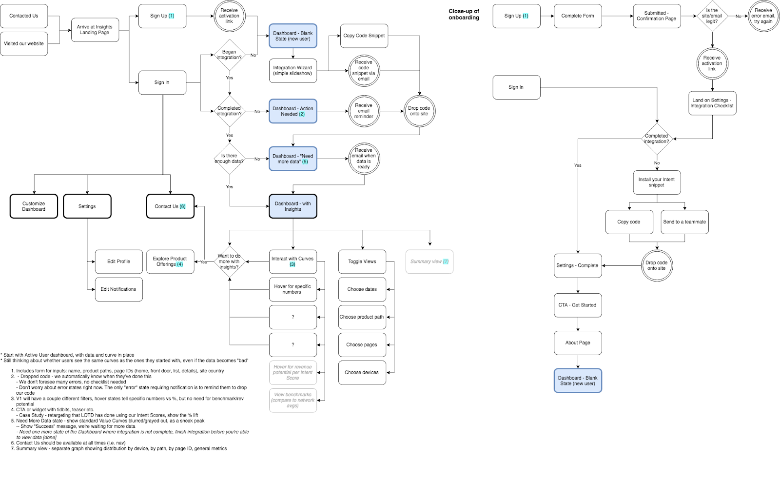

Working closely with partner-facing colleagues, I mapped out the end-to-end user flow.
Design Direction

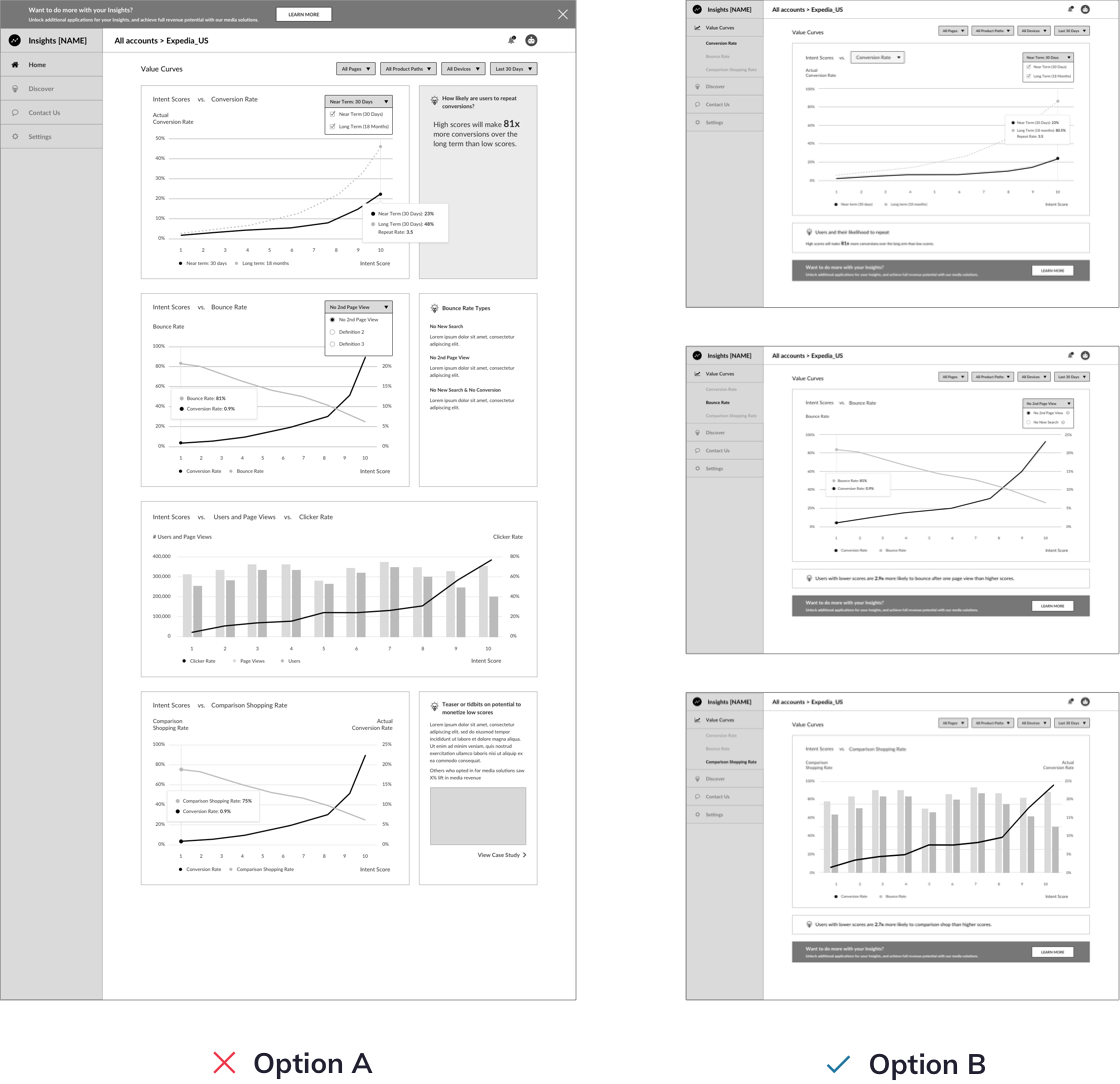
During the wireframing stage, I pivoted the design direction; the first design I tested (Option A) was a dashboard with multiple graphs on one page. However when placed in front of users (n = 4), the below feedback led me to ultimately recommend Option B for our design direction:

  1. 3 out of 4 users found Option A's multi-graph view overwhelming. Option B's single-page app format allows focus on one graph at a time.
  2. 100% of users preferred Option B for intuitiveness. There is more real estate for affordances to teach complex concepts, and a prominent CTA indicates next steps.

Usability Testing: The Dashboard

Since we had limited access to external user input due to strict business constraints, and our partner-facing teams had frequent access to the needs and feedback of our partners, they became our proxy users in our initial usability testing sessions. Our prompt for the user was: Visit Insights to view up-to-date data analyses generated for your site. Interact with the site to learn more, and inquire about next steps.

Below are some usability test results for just one page of the dashboard.
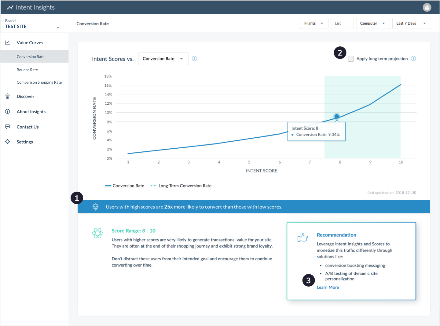
Version 1

In this session (n = 10), all users discovered organically that they can hover over the curves for more context. 80% of users knew how to learn about next steps. We were on the right path, but there were frustrations:
  1. “The [blue] tidbit and contextual information are not noticeable enough.” -account manager
  2. “How would a new user know how to use this [additional layer]?” -sales team
  3. “... [it] would be nice to have everything in one view and eliminate scrolling” -account manager

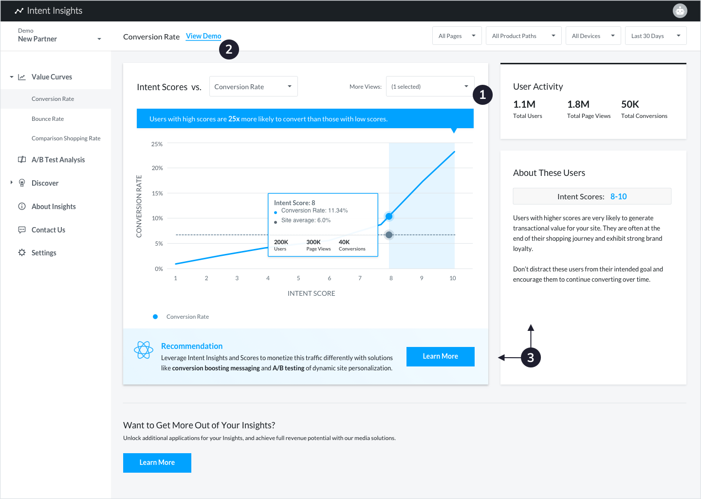
Version 2

As validated by testing (n = 10), I learned that users won't read everything, so I applied some hierarchal changes to improve the progressive disclosure experience. Here's how the final design addresses earlier pain points:
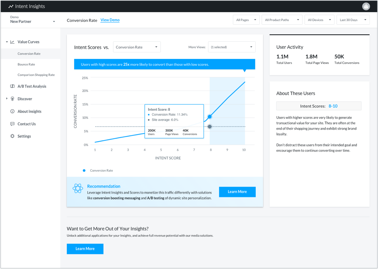
  1. Relocated contextual tidbits provided "clear call-outs on the graphs and emphasizes" our predictive technology.
  2. A demo on understanding insights was added, which 30% of users engaged with and found helpful.
  3. Dynamic takeaways and CTAs were shifted to reduce scrolling. The flow "makes sense...makes things directly clickable." -acccount manager

The Result

To build our MVP from scratch and get it ready for testing as quickly as possible, our engineer and I collaborated closely via a shared workflow (which involved my learning git) so that I can contribute to the front-end HTML/CSS. After several rounds of design iterations and development, we launched the dashboard experience for a group of beta testing partners to continue gathering feedback from internal as well as external users!

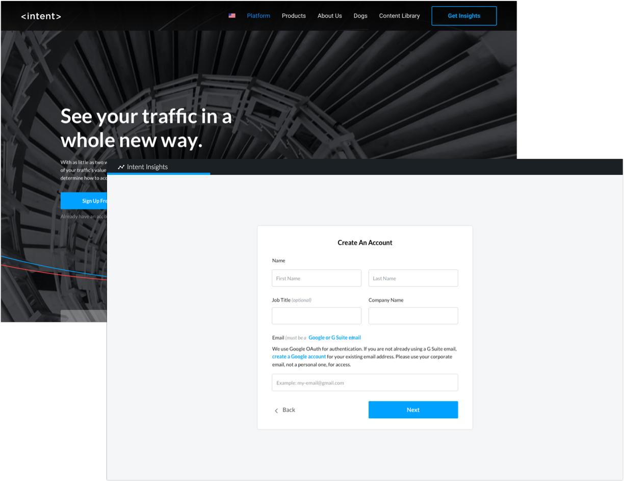
Pitches + onboarding Now that self-service onboarding is live, the 5+ touchpoints previously required to screen and integrate partners was reduced to a 1-time screening via form submissions. Our stakeholders loved that “the vision to go from integrating 10-20 sites to 100s of sites per month” became more feasible as a result.
Generate + share data insights The process for generating insights for partners can now be conducted 50% faster. Our teams previously spent ~2 hours per partner manually generating these graphs, but the dashboard automated this step and helped save about 1 full day's worth of work per week. Additionally, external users can now visit any time for data insights rather than wait 2+ weeks for an update.
New product discovery Our beta testing partners "love it because they could grasp the data at their own speed,” even outside of biweekly check-ins. A curated 20-page slide deck has been condensed to 1 single interactive page on the dashboard to pitch our newest data product within context of the partner's own data!

Conclusion

Self-service onboarding is now live on our website and allows partners to sign up for access to the Insights Dashboard. While we continue to integrate new partners, I'm collaborating closely with data scientists and optimization managers to translate additional machine-learning concepts to interactive experiences that are intuitive and educational. The feedback we've gotten validates the potential for this product to strengthen existing relationships as well as open conversations with untapped markets.

This project helped me learn to empathize with two different types of users: our internal teams, in need of a scalable process to onboard partners, generate insights, and pitch new data products; and our external ecommerce partners, who needed an intuitive tool to opt into additional applications on our machine-learning platform. Going forward, I'm insisting on shifting more emphasis toward championing the partner's needs.

Due to confidentiality reasons, feel free to contact me directly for a demo of the dashboard or to discuss my design process in further detail! Back to projects